
Why your moving-average ribbon lies in a range
A stack of moving averages looks authoritative and reads beautifully in a trend. In a range it does the one thing that costs you most: it generates confident signals that are all noise.
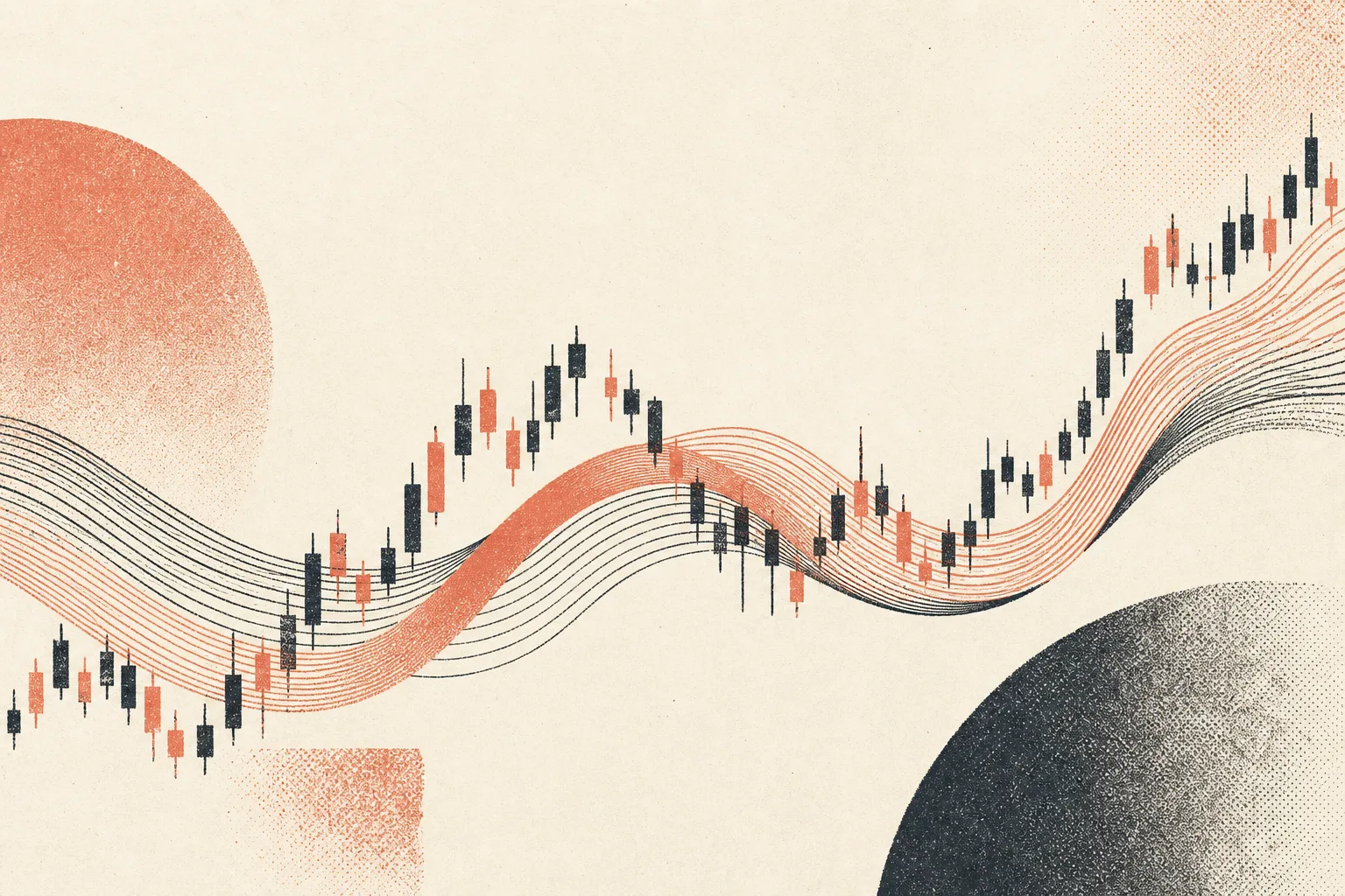
A moving-average ribbon is one of the prettiest things you can put on a chart. Eight, ten, twelve averages fanned out, spreading and compressing like something breathing. In a clean trend it’s genuinely useful. The ribbon widens, the order stays neat, and you can see the strength of the move in the spacing. Lovely.
Then the trend ends, the market starts ranging, and the same ribbon turns into a liar.
What the ribbon is really doing
A moving average is just a smoothed memory of recent price. Stack a few of different lengths and you’re looking at price’s memory at several speeds at once. In a trend those memories all point the same way, because price keeps making the recent past look like the direction of travel. The fast ones lead, the slow ones follow, everything’s tidy.
In a range there is no direction of travel. Price is sloshing back and forth around a mean. So the averages cross, and cross back, and cross again, braiding into a knot. Every one of those crosses looks like a signal. The ribbon flips from bullish stack to bearish stack and back inside a handful of candles, and each flip arrives wearing the exact same confident face it wore during the real trend.
That’s the trap. The ribbon doesn’t know it’s in a range. It can’t. It’s a tool for measuring direction, and you’ve handed it a market with no direction. It answers anyway, because that’s all it can do. The signals don’t stop. They just stop meaning anything.
Why it costs you specifically here
Ranges are where accounts bleed out. Not in the big losing trade, usually. In the death by a thousand crossovers, where you take the ribbon flip long, get stopped, take the flip short, get stopped, and do it six times before lunch. The ribbon generated every one of those entries and every one was noise. The tool wasn’t broken. It was being asked a question it has no way to answer, and it never says “I don’t know.”
The fix isn’t a better ribbon
People respond to this by tuning. Different lengths, a smoother variant, an extra filter on top. It rarely helps, because the problem isn’t the settings. It’s that a trend tool is being used in a non-trend. The honest fix is to know which regime you’re in before you trust the ribbon at all.
That means something on the chart that reads range versus trend directly. Whether price is expanding or coiling. Whether there’s a real directional push or just chop around a level. When that read says “ranging,” you ignore the ribbon entirely, because you already know its answer is meaningless here. When it says “trending,” the ribbon goes back to being the useful thing it was.
A moving-average ribbon isn’t a signal generator. It’s a trend gauge that lies fluently the moment there’s no trend to gauge. Treat it as one input that only earns a vote in the right conditions, and it stops costing you the afternoons it used to.
The useful version
A moving-average ribbon is a trend-state tool. It is not automatically an entry system.
In a real trend, separation between averages can show direction and pace. In a range, that same ribbon becomes a delayed description of chop. It flips after price has already moved, compresses when the useful trade is almost over, and tempts you to buy exactly when the range is ready to mean-revert.
What to add before using it
Give the ribbon a regime filter:
ribbonSpread = math.abs(ta.ema(close, 20) - ta.ema(close, 50))
spreadOk = ribbonSpread > ta.atr(14) * 0.25
That is not a magic threshold. It is the right kind of question: is there enough separation for the ribbon to mean anything? Without that, a ribbon in chop is just a colourful way to enter late.