
Why your chart feels exhausting (and what to do about it)
Most traders aren’t short of signals. They’re drowning in them. Why a cluttered chart quietly drains the read you’d have made on instinct, and how to get it back.
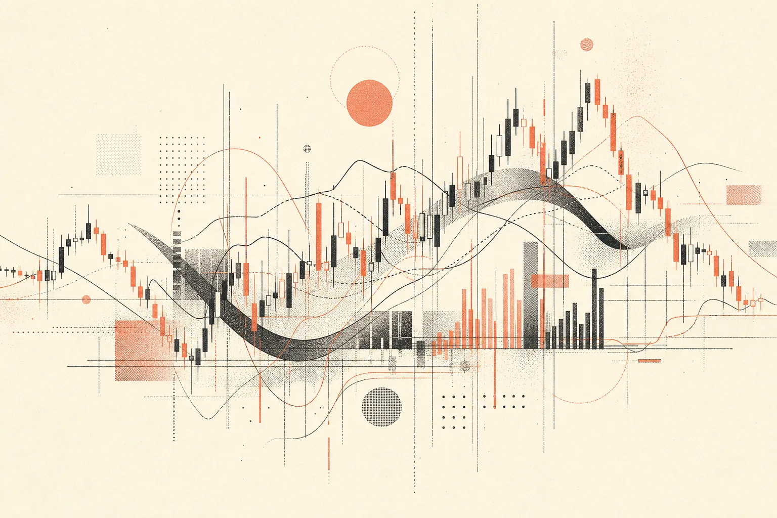
There’s a tiredness that has nothing to do with how long you’ve been at the screen. You sit down fresh. Coffee, clear head, market not even moving yet. An hour later you’re fried. Not because anything went against you. Because you spent that hour refereeing a chart that won’t stop arguing with itself.
I see it constantly. It usually starts innocently. One moving average, because a moving average is sensible. It works, so a second one goes on for confirmation. Then an oscillator, because you got chopped to bits one afternoon and swore never again. Then a volume tool. A session marker. Some “smart money” script off a forum that looked clever in the screenshots. Every single addition made sense at the time. Put them together and you’ve assembled a committee that never reaches a vote.
The cost isn’t screen space
The busyness isn’t really the problem. The problem is what every conflicting element does to your attention. Each one demands a tiny decision. This says long, that says wait. Do I trust the fast signal or the slow one today? On its own, harmless. Now multiply it by every candle, for hours. That’s where the fatigue comes from. You’re not reading the market. You’re arbitrating your own tools, and arbitration is expensive.
Here’s the part that stings. The better your instinct, the more this hurts. If your edge is partly a feel for how price moves, clutter is poison, because the noise drowns out the exact read you’d have made without thinking. The committee shouts over the one voice on the chart worth hearing, which is yours.
What a clean chart actually buys you
Folding a stack into one coherent setup isn’t about owning fewer features. It’s about the chart speaking one language. One colour means one thing. A signal means the conditions you genuinely care about have lined up, not that tool number seven flickered. The chart stops contradicting itself, and you stop bracing against it.
When that happens something quiet shifts. You stop staring. You glance, you take in the state of things, you look away. That recovered attention, the mental room to actually think, is the whole prize. People reach for it by adding a cleaner indicator. It almost never comes from adding. It comes from removing.
A test you can run right now
Look at your chart. Pick any single indicator on it and ask one honest question: if this vanished, would my decisions get worse? Not “would the chart look emptier.” Would I actually trade worse.
Most people can drop half their stack and lose nothing but noise. And the half that stays tends to work better the moment it isn’t elbowing for space with five things that say the same thing. That’s nearly always where a good rebuild begins. Not with what to put on. With what has quietly stopped earning its place.
The useful version
The practical fix is not “make the chart minimal.” It is to make every visible thing earn one job.
Make a quick inventory with four columns:
- What does this tool decide?
- Does another tool already decide the same thing?
- What action changes when it appears?
- Did I use it in the last ten real trade decisions?
If the answer to the third question is “nothing”, the tool is decoration. If the answer to the fourth is “no”, it is probably historical comfort rather than live edge. The chart should not display information just because it was once interesting.
A cleaner build rule
Keep one tool for market state, one for trigger, one for risk, and one for timing. More than that is usually a sign the system has not chosen what it believes.
For example: a session box can give context, a level script can define risk, and one trigger can decide entry. If three oscillators are all saying “momentum is stretched”, keep the one you actually act on and remove the other two. The point is not fewer pixels. The point is fewer unresolved arguments.